After I drew me in Pokemon by hand I scanned it into the computer and went over it on a different layer as well as the shading. I didn’t have time to add in the shading, so I just duplicated and coloured in the outline layer.
After I drew me in Pokemon by hand I scanned it into the computer and went over it on a different layer as well as the shading. I didn’t have time to add in the shading, so I just duplicated and coloured in the outline layer.

I learned how to do gradients for a fill and outlining for an asset through it’s property options.
The gradient gives the creator to create effects easily with just a few simple actions. The positioning lets me to hide parts of the assets I don’t want to use for that image and create a more stylish looking image if done correctly.

This is a simplistic image created in Illustrator to understand how the navigation worked. We learned about the Pathfinder tool and how to edit objects as well as some advantages and disadvantages over Illustrator to Photoshop.
Ash Ketchup from Pokemon

This is a re-creation of Ash in Pokemon in a standing up pose. This was made to practice my re-creating an artist’s drawing style. It was not fully shaded in, because I decided it wasn’t really needed.
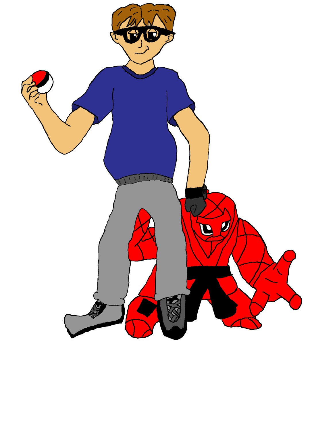
Me in Pokemon

After I had some understanding of how the drawing style worked, I started to draw what I would look like in Pokemon. I originally tried to draw me in a pointing pose, but I couldn’t get the dimensions right, so I just copied a standing pose body shape. I added in the cat stealer t-shirt, because I still cats, just kidding, maybe? I probably should have drawn Meow for my pokemon.

Behold my new creation! Adele the Melon!
This image is a mask Photoshop practice, where I put Adele’s face on a melon. I was originally going to add her hand, but decided not to later. I copied and pasted the layer twice and removed one side of the face for both layers. I then hid here facial features outside the eye’s nose and mouth.
At the end I decided to change the colour of the inside of the melon to a glowing pink, because I thought it fitted the creation I made.


Today I did some Photoshop practice for hiding unwanted images. I used the stamp, healing brush, selector and paint brush tools.
The stamp tool was used to overwrite pixel colour codes with similar pixel colour codes to hide the fact there was a Pikachu there. The healing brush was to merge the Pikachu into the cloud, so he couldn’t be seen. The selector tool was used to select specifically the Pikachu and nothing else, then I used a combination of the brush and stamp tool to overwrite the incorrect areas.

The artist: Alexander Ostrowski
This image uses an analogous colour scheme which is used very effectively to make the image blend together well.
The lighting of the image from all sides is pushing your attention towards the middle and then pushes you to the path. This is a very clever way of creating a pattern for the image. The stones on the path is also guiding you towards the stone in the middle, which shows that it is the main focus of the image and has a very good contrast for this image.
The size composition of the stone compared to the rest of the image is strikingly big, which emphasises the importance of it and catches the viewer’s attention straight away.


when creating art there are multiple ways the artist can create it. these are the ways an artist can use the colour wheel to create a piece of art (going from top left to bottom right):
Achromatic or gray-scale is the colouring of an image in just different lightings of black. Gray scale is a good colour technique when trying to make something look lifeless or old, it is a good technique in serious loking images.

Monochromatic is the use of a single colour with different types of lighting added in.


The image in the big circle is the final drawing after all the previous attempts. There was a total of 8 attempts, but these are my best 4, plus I messed one up.
