Chocobo Crystal Hunt Review

The game objective is to collect all 4 crystals or 6 crystals to win the game. It’s a simple objective, yet a lot of fun.

At the start of the game, each player is assigned a character token with a Fat Chocobo and a crystal of that element, unless you are the 5th player and pick up the normal character token, then you just receive a Fat chocobo. You then pick up cards until you have 3 and each player takes it in turns to try to grab a crystal from another player, picking up a card per turn, except the first player on turn 1. If you succeed in the hunt you get that crystal and another go if you used a Chocobo, but if you fail, you discard the card used if it is a Chocobo and then end your turn. If a trap is revealed, you must do what the trap says to do.

I didn’t really like the first player not picking up a card, because you can’t get a first turn win, while the other players can, I don’t know how you could fix this issue, but it is a game mechanic I don’t like. Talking about game mechanics, there is a hidden player mechanic of shuffling your hand, which I find very interesting that they didn’t mention. This hidden mechanic uses the players psychology of pleasure with the discovery of something hidden, which I really enjoyed.

I really like that the theme of the game informed what the game was going to be like before I played it.

Because the game is so simple and uses pictures instead of words, that means the game can be played in multiple languages. It also helps reach their target audience of all ages, because it’s so simple a child can pick it up and play it with ease.

The price you are looking to pay for the original set is between £10-20, the expansions are relatively the same, but are typically slightly cheaper.
DC Deck Building Game Review

This game’s objective is to buff up your deck with new abilities and gain the highest score at the end. The game ends when either all the Super Villains or Super Heroes (depending on the version being played) are gone or there are no more cards in the main deck.

At the start of the game each player are given a Super Hero or Villain, 7 punches and 3 vulnerabilities. Each player takes it in turn to draw 5 cards and to buy a card from the line up, a kick or the enemy Super Hero or Villain with power equal or greater than the cost of the card.

The enemy Super Hero or Villain has a game mechanic that really works well called “First appearance”, which as it suggests activates an ability when the card is first shown. The abilities always is bad to my experience and I think this is a very good game mechanic, because it shows you that they are powerful.

The synergy of all the cards having unique abilities make the game feel more alive and interesting, which really works well with the buying in-game mechanic, because it really makes you think before you buy a card in which card will be better later on.

Weakness’ at first seem to be plain cards that block you from using better cards, but with the synergy between the weakness’ and Super Heroes or Villains make them more useful and interesting, for example: if you have 4 different card types in your discard pile +2 power. This really spices up the gameplay.

The target audience was of people aged 15+ and I think they achieved their target audience for visuals, but the gameplay could use with a little bit more complexity and options available to the player in my personal opinion.

There are a few downsides to the game, such as the lack of strategy, because your choices per turn are already preset and all you can do is hope for that card you bought and the length of the game, because it can take forever to complete one game and is not ideal for a quick game between work.

The standard cost for a first hand completed set of this game seems to be around £35 and an expansion seem to go from £8-20, depending on how new the set is and if it is first or second hand.

Primary and Secondary Research

Primary Research

Definition:

Any data collected that doesn’t already exist by the means through surveys, questionnaires, etc.

Examples:

  • Survey

Pro: Data gathered is simple and can be automatically calculated by a machine.
Con: It is too bland that it could mean a multiple of things

  • Focus group

Pro: Gather feedback from specific individuals.
Con: No one could show up.

  • Customer Trails

Pro: Let the customer experience the product for free, while getting feedback on improvements and things that went well.
Con: The customer could hate the product and give bad publicity.


Secondary Research

Definition:

Any data that already exist and has been discovered and created into information at an earlier date, which may not necessarily has been used, but probably has.

Examples:

  • Internet

Pro: Can give you quick access and copies of files on the collected data.
Con: Can contain viruses and malware, even from a trusted source, because of hackers and worms.

  • CD/DVD

Pro: All data is in easy to understand information form and examples can be shown straight to you.
Con: Requires a CD/DVD ROM to access.

  • Books

Pro: All data is in one place and probably neatly organised.
Con: Data is probably outdated.

New project

I am working on a new project, which is creating a standalone card game for a competition sponsored by Productive Radical Associated Table-Tops, which is a mouthful and a half.

The competition involves gathering new and old data, creating a standalone card base game with a guide and essays for proof of development, which will probably not be published to the public.

The type of research will be from primary and secondary sources, so I will have a wild range of data.


Definitions

Primary source – Data that I gather through tests, talks, graphs, etc.

Secondary source – Already existing data I have gathered.

Final character design update 01

For the first part of the character design I did it in Adobe Illustrator.

I edited the lines to make them fit with the image more, because originally I was just going to hide them in Photoshop.


Adding outlines

This slideshow requires JavaScript.

The next step of the design was making the outlines to resemble to Tetsuya Nomura’s as possible. I used Illustrator for this, because it has a built-in tool that changes the stroke pattern and width and I don’t think Photoshop has that.

Drawing me in different stances

We took photographs of are self for are character pose, so we could use them as reference photos, but I will not be showing the photographs I took of myself for security reasons.

Once the photographs were taken, we drew the sketches out to see what they look like and how complicated they are to draw. This was done to get us ready for our final design drawings.

Throughout this I included the 50% head height increase and it seem to have worked, but I couldn’t get the head right for the middle or second stance. The body was relatively easy, but not the easiest, that was the third stance.

Colours for my character

character personality and the colours

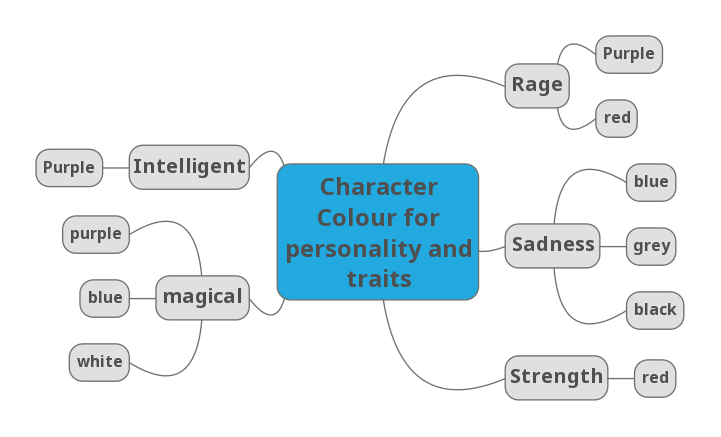
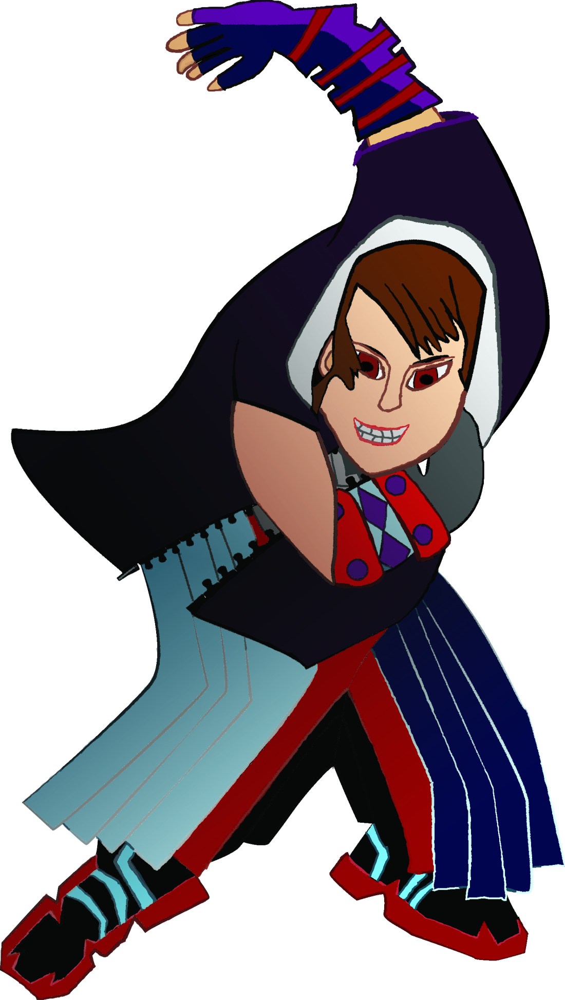
My character will be slightly magical, very strong and filled with rage and sadness. I will probably add in some black to resemble darkness and emptiness.

My character will be a very intelligent character, which might be resembled through his gloves. The strength and rage will be shown through his trousers and sadness and magical will be shown through the top half, with maybe some other colours here and there.


Why I chose them colours

I chose the colour red and purple for anger, because in the games red is seen as a powerful and a vicious colour, why purple is seen as rage and power.

The game is fantasy base and the colour purple is seen as a very magical colour, because it is so rare that when it is seen it gives the image or seen the sense of something special or magic. I chose blue to represent a sad magic for the colour of tears for the sadness the character has suffered. White is there to show there is still some light in me and is seen as good magic and shows I still have virtue in what I do.

The colour red was chosen, because red is seen as a powerful and dangerous colour as well as romance, this resembles my two sides. I am dangerous to approach and contain such power, but if you show me love and appreciation, then I will let down my guard and show you my light side.

Purple was chosen for intelligence, because purple is seen as a very sophisticated colour and will probably be the colour of my weapon, to show that it will be used intelligently.

Black, grey and blue was used for sadness, because these are seen as dark and depressing colours. Black can show I’ve been lost to the darkness, grey shows conflict of my two sides and blue is the  sorrow i feel inside.

Tetsuya Nomura compared to my drawing

Tetsuya Nomura’s creation is on the left and mine is on the right. I was trying to create the real life version of me into the Kingdom Hearts universe as if Tetsuya Nomura drew it. I think I did a very good job, but am still not quite there.

The hair is very off for this version of the style, but it later renditions is very close. I was basing my design off of the old version, but took parts from the later versions. The hair in this version has too much detail and should be more simplistic like Tetsuya Nomura’s. The hands could probably use a slight increase in size, but only a little, about 5-10% increase.

The face is quite close, but now realise I was drawing the video game version and not the drawing version, so I just need to adjust that in later versions.

The outlines and body shape is almost spot on, but needs less depth and more energetic movement.

Kingdom Hearts character outline development

Once I drew the character and was happy with my result, I copied the front view 3 times and tried to get the character to look more like it belongs in Kingdom Hearts.

The first thing I did was to give it thicker depth strokes when lines connected. It look remarkably better, but still not exact. I then tried shading in shadows. It looked somewhat like Tetsuya nomura’s art style but not exactly.

I did the previous two styles, because I noticed his lines thicken up when connected and thin when separated, but it wasn’t consistent, so I tried adding in shadows only, to see what it would look like.

The final thing I did was combined the two outline styles, which made it look more like it would if Tetsuya Nomura drew it, but the lines seemed a bit too big, which I noted for future drawings.